

Turning a first-draft AI artifact into content that actually resonates
# AI Best Practices
# Design
# HTML Dashboards
# How-to
The repeatable process I used to take an ordinary AI output and turn it into a polished, customer-ready artifact
July 7, 2026
Mark Christianson
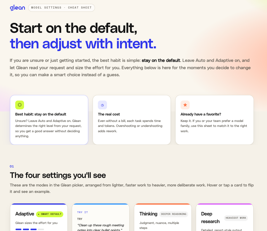
People keep asking me the same question about the Glean model settings cheat sheet: "How did you get to that result?"
The honest answer is that it was not one prompt and a lucky output. It was a process. And the most important part of that process had almost nothing to do with visual design tricks. It had to do with getting very clear on who the thing was for and what I wanted them to walk away understanding, feeling, or deciding.
That is the real shift with AI. You no longer have to fight the software to make something look clean and modern. You can ask for that and get it. What actually matters now is your ability to direct: to tell the AI the goal of the output, not just its appearance. Once the AI knows you are trying to evoke calm confidence, tell a story, or move someone toward a decision, the design choices start serving that goal instead of just decorating the page.
This guide walks through the patterns and practices behind that, using the cheat sheet as a running example.
The one idea to internalize first: design is downstream of the decision
Before layout, before color, before "make it a dashboard," answer three questions about your audience:
- Who is this for, specifically? Not "users." A frontline employee who feels intimidated by AI is a completely different reader than a skeptical engineer with strong model preferences.
- What do they need to understand, feel, or decide? Understanding, emotion, and decision are three different jobs, and they lead to three different designs.
- What is the one thing they should do or believe when they close the tab?
For the cheat sheet, the answer was: everyday employees who quietly wonder if they are using AI "right," who need to feel that this is not intimidating, and who should walk away with one habit, stay on the default unless you have a reason to change. Every later design choice traces back to that answer.
You can see this in how I framed the very first ask. I did not lead with format, I led with intent and a constraint about accuracy:
"Create guidance for glean users on model settings and how to choose them for the type of task. Dont assume the default in glean is there for the same reason the model providers set because glean is trying to optimize, so use our own internal points on that part."
And when I later steered it toward the audience explicitly:
"Lets consider how this could become a customer facing reference sheet, end users get frustrated quickly so we want to be visually compelling and easy to absorb for the regular general user. It should make it easier to understand and could be a useful 'cheat sheet' to help them build habits."
The calm color, the flip cards, the "start here if unsure" language, none of it was decoration. It was all in service of lowering intimidation and landing one habit.
When you can name the audience and the goal, you can hand the AI something far more useful than "make it look good." You can hand it intent.
Why it is never a one-shot
The finished product looks clean, so people assume it arrived clean. It did not. It moved through distinct stages, and each stage had a different job:
- A plain draft to get the substance right, with no styling at all
- Rounds that added the actual teaching content: business tasks, the cost framing, a way for people to test settings themselves
- A truth-check against the real product interface, which changed the vocabulary
- A truth-check against how we actually work internally, which changed a recommendation
- Customer feedback that changed the tone
- A visual rebuild once the content and tone were settled
- Fine detail edits on layout, interaction, and wording
- A final rebrand pass to make it feel like a polished, on-brand asset
If you try to do all of that in one prompt, you get a mediocre version of everything and a great version of nothing. Separating the stages is what let each one be good.
The patterns
1. Start with the audience and the goal, not the layout
Resist the urge to open with "build me a dashboard." Open by telling the AI who the reader is and what should change in their head. Layout is an output of that, not an input to it. When I asked for the visual build, I did not lead with "make a nice page." I led with the reader and the job: everyday users who get frustrated fast, a sheet that is visually calm and instantly scannable, built to help them form a habit. The look was in service of that, not the other way around.
2. Draft ugly first, lock the substance
The first version had no design at all. That was on purpose. If the words are wrong, a beautiful layout just hides the problem. Get the thinking right in plain text, then dress it. Styling early is one of the most common ways people waste time, because every content change then forces a redesign.
3. Ground it in truth before you polish
Two truth-checks changed this artifact more than any styling did.
First, the interface check. The early drafts used "Auto" and did not treat "Deep research" as a first-class option. What triggered the fix was a plain question, plus a screenshot of the actual picker:
"Does this align to our settings in glean? Its important that what we offer aligns to what the user will see in the interface."
The screenshot showed the real labels were Adaptive, Fast, Thinking, and Deep research. If what you publish does not match what the reader sees on their screen, you lose trust instantly, no matter how good it looks.
Second, the internal-reality check. It would have been easy to recommend one thing to customers while our own teams did something different. I called that out directly:
"I noted that our internal teams lean towards Claude opus for html artifacts and we have some evidence of using openai for image generation so use some internal information to align to the guidance so we arent internally using some choices and recommend something else for users."
Checking how we actually work led to more honest guidance, for example acknowledging where a stronger model family genuinely fits certain tasks. Align your advice to reality before you make it pretty, because polish makes wrong information more convincing, not less.
4. Tell the AI the goal of the output, not just its appearance
This is the heart of the shift. "Clean and modern" is table stakes now. The leverage is in telling the AI what the design is supposed to accomplish:
- to reduce anxiety and make something feel approachable
- to build a narrative that carries the reader from confusion to confidence
- to move a skeptical reader toward a specific decision
- to make one habit impossible to miss
Those goals produce real design decisions. "Reduce anxiety" is why the cheat sheet favors short cards, generous space, and a single clear starting habit instead of a dense wall of options. When you name the emotional or decision goal, the AI can choose color, density, motion, and hierarchy in service of it. When you do not, you get generic polish that looks fine and persuades no one.
Sometimes directing the goal means being blunt about a miss. When an early visual attempt fell flat, I did not tinker with it, I named the standard I wanted it held to:
"unfortunately the layout is terrible, this needs to be customer facing, high quality and visually engaging."
That one sentence carried the goal (customer-facing, high quality, engaging) and gave the AI room to rebuild rather than patch. Directing the outcome beats micromanaging the pixels.
5. Bring your preferences to the table
The AI does not know your voice or your constraints unless you tell it, and it will happily default to habits you dislike. State them plainly and early: how you like to write, what you never want, the tone you are going for. For me that meant a warm, direct voice written straight to the reader, no jargon, no upsell, and specific punctuation preferences. Your preferences are part of the direction. Treat them as reusable instructions, not one-time corrections.
6. Iterate in tight, specific loops
The best edits in this process were small and precise. Here are two of my actual annotations, pointed at specific elements:
"this section overflows the box, we need a better way to show. Consider just using the name and not the description to save space, we can define those elsewhere in the sheet."
"can these be flip cards? Where a hover or click appears to flip them over and reveal examples?"
Notice the shape of these: point at the exact element, say what is wrong or what you want, and let the AI handle the how. Specific, scoped feedback produces clean changes. Vague feedback like "make it better" produces churn.
7. Let real feedback change the thing, including the tone
A customer said something that reshaped the whole voice:
"this semi addresses it but how do you get people to not think model? My engineers are VERY particular on what model they use."
That single piece of feedback shifted the guide from "here is what to pick" to "here is what these settings mean, decide with confidence." It is why the sheet now respects power users with strong preferences instead of talking them out of them. Design is not only visual. Tone is a design decision too, and the audience will tell you when it is off if you let them.
8. Test against reality, not just the happy path
Ask whether the artifact survives contact with the real world. Does it hold up on a phone. Does it still make sense printed in black and white. Does the interaction degrade gracefully for someone using a keyboard. The flip cards, for example, needed a version that stacked both sides when printed, so the examples were never lost on paper. A design that only works in the demo is not finished.
9. Publishing is a stage, not the finish line
Shipping the link was not the end. After it was live, customer reactions drove more edits, and then a full rebrand pass. Build for republishing: keep the same link so you can improve the thing in place without asking everyone to re-bookmark it. The best assets keep getting better after they go out.
Watch the output actually progress
The fastest way to make this real is to see the same cheat sheet at each stage. These are the actual screenshots, in order, from the first draft to the version that went to customers. Not painfully detailed, just enough to feel the arc.
Stage 1: the expected first output. This is roughly what most people get on a first pass, and it is fine. The substance is there, but it is text-heavy and reads like a document, not a reference someone scans in the moment.
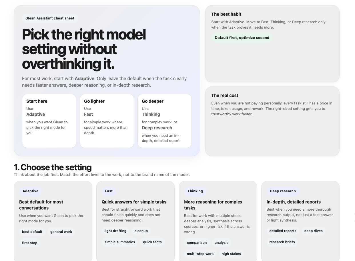
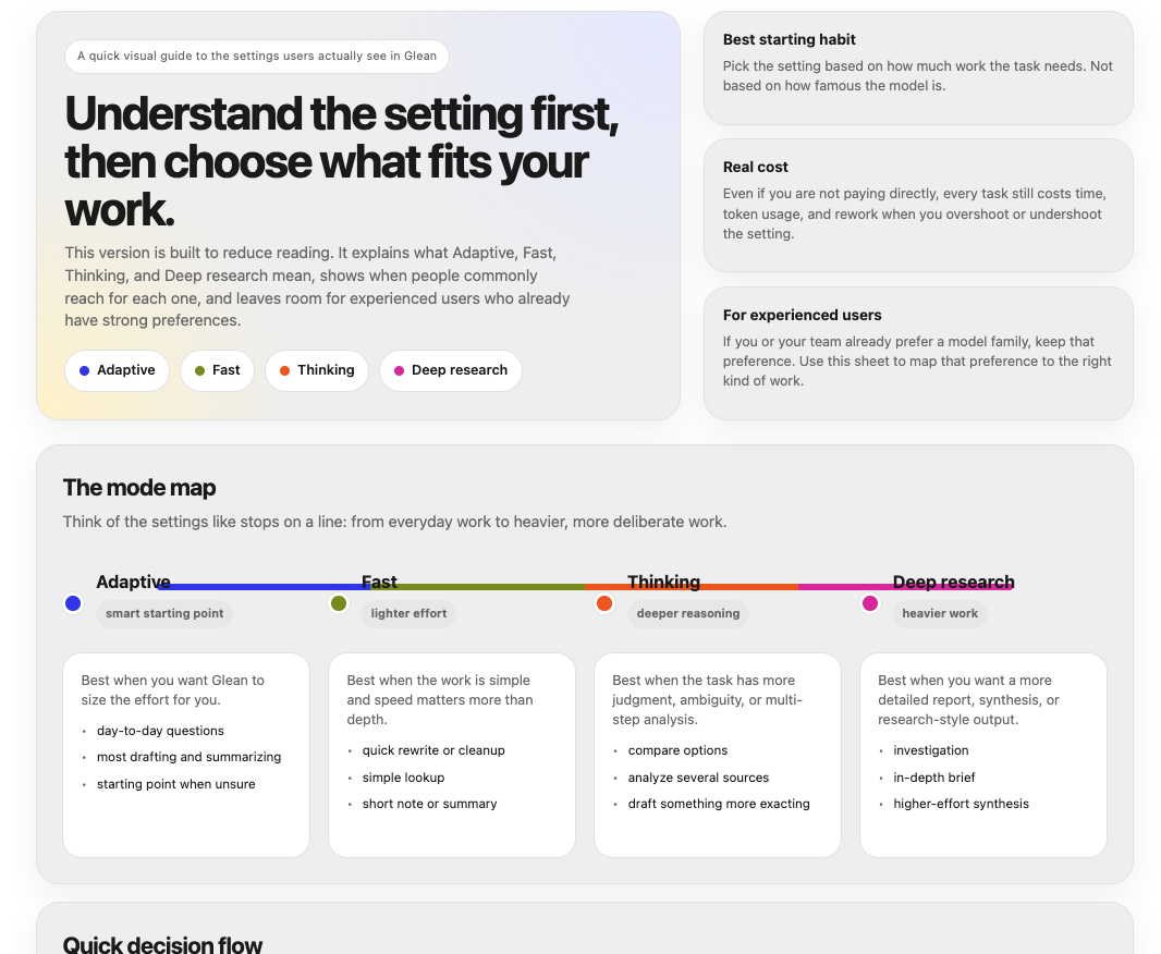
Stage 2: leaning away from text, but not there yet. Here it started to show the four modes visually and tried a timeline-style "mode map." The problem: the modes are not actually connected steps, so the timeline framing did not fit, and the formatting had not caught up to the idea.
Stage 3: real progress after honest feedback. Once I told it plainly that the design was terrible and had to be customer-facing, we made the structural leap toward what actually shipped: clean, color-coded cards, clear hierarchy, and a layout built to be scanned.
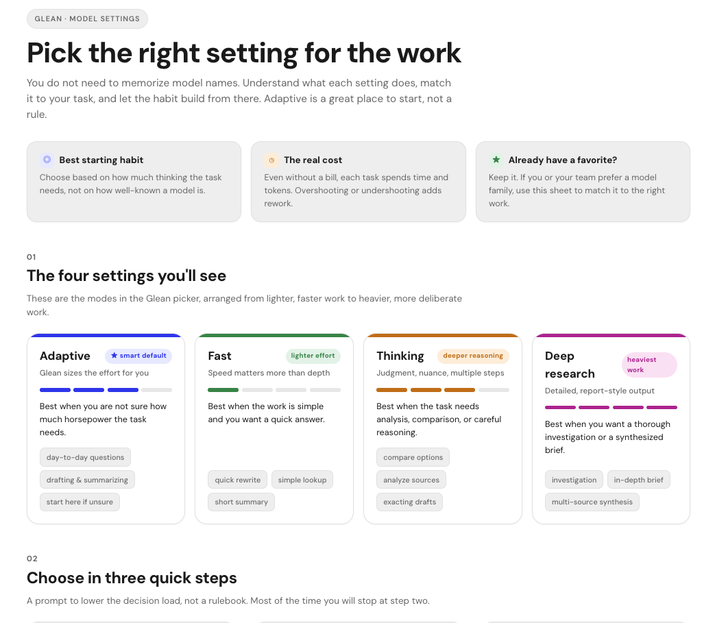
Stage 4: refining details and the core habit. From here I used the artifact's edit feature to select individual elements and fix text issues and overlaps, and I locked the overarching takeaway: start on Auto and Adaptive, but feel comfortable about what the other settings do and when to use them.
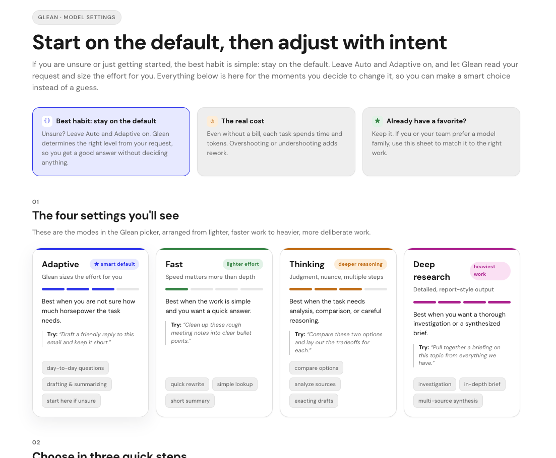
Stage 5: flip cards to keep the front clean. The added examples made the cards a little busy, which is what led to the flip-card idea. The front stays calm and scannable, and the example lives on the back, revealed on hover or tap.
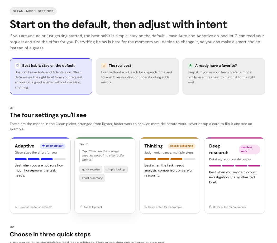
Stage 6: the Glean look and feel. Only at the end did I apply the brand treatment: the Glean brand, the two-tone headline, the peach hero wash, and the reserved lime accent. The polish came last, on top of settled substance and structure.
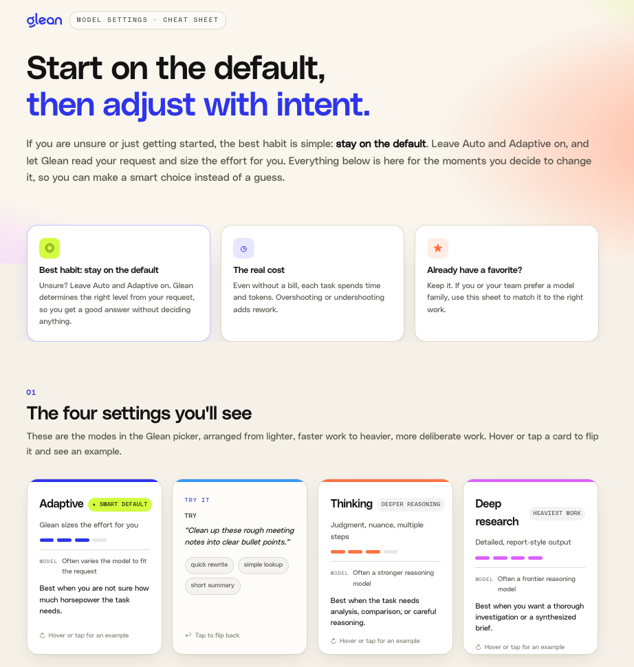
If you want to show someone the arc in one glance, it looks like this:
- Idea and raw substance, in plain text
- Real teaching content added, still plain
- Aligned to the actual interface the reader will see
- Aligned to how we genuinely work internally
- Tone corrected from customer feedback
- Rebuilt visually, with the goal driving the design
- Refined through small, specific edits
- Published, then improved in place, then rebranded
Notice how much of that is thinking and truth-checking, and how little of it is "make it pretty." The looks came near the end, and they came fast, because by then the AI knew exactly what the design was for.
A reusable prompt scaffold
When you are ready to ask AI to design something, try giving it these five things instead of "make me a dashboard":
- Audience: who specifically will read this, and what is their state of mind
- Goal: what they should understand, feel, or decide by the end
- The one takeaway: the single thing that must land
- Constraints and voice: your preferences, your do-nots, your tone
- Reality checks: what it must match to be trusted, and where it must work (mobile, print, accessibility)
Then let the design follow. You will spend your energy on direction, which is where your judgment actually adds value, and let the AI carry the craft of making it look clean and modern.
The mindset shift in one line
You used to be the person struggling to make something look good enough. Now you are the director, and the AI is your designer. Your job is to be crystal clear about who you are talking to and what you want to happen inside their head. Get that right, ask for clean and modern, and the design will start to mean something.
See where it landed
You have watched the whole arc, so here is the finished product. Open it, flip a card, and notice how the last version quietly does everything the earlier ones were reaching for: calm to scan, honest to the interface, and built around one clear habit.
Comments (0)
Popular

Dive in
Related
Resource
From Source Material to Usable Output with Glean
By Mark Christianson • Jun 30th, 2026 • Views 205
Resource
From Source Material to Usable Output with Glean
By Mark Christianson • Jun 30th, 2026 • Views 205